Alamo MD – Full Branding
Overview
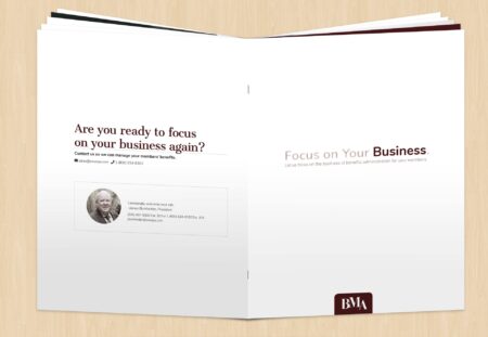
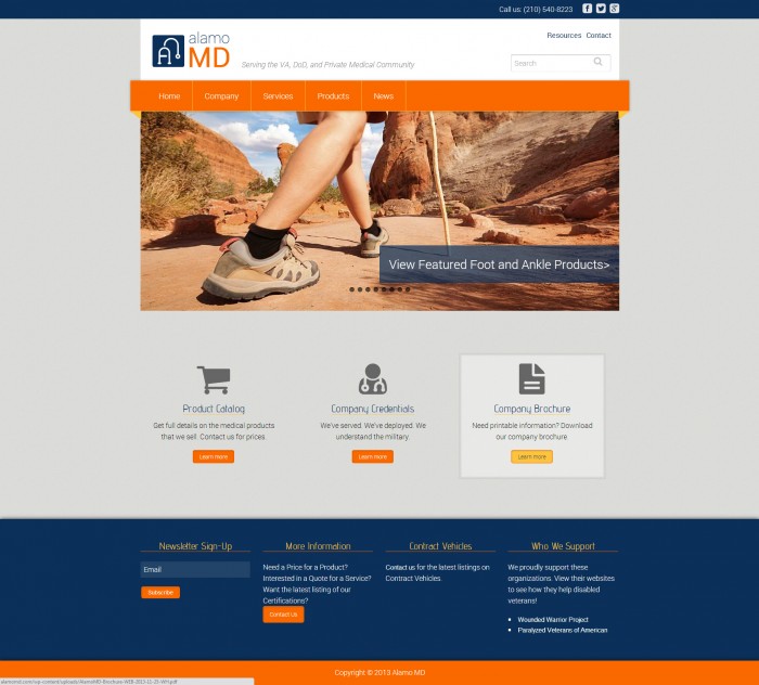
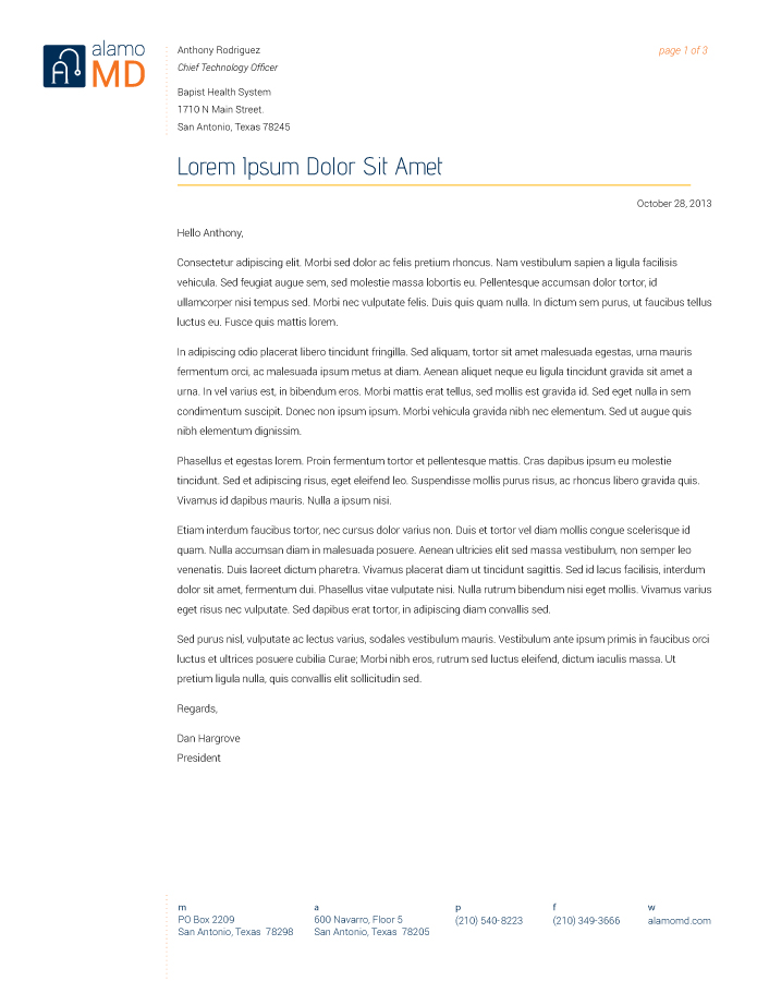
I worked on this project through my web development company. I fully designed and developed the website for this company using WordPress as the CMS; I also designed and developed an easy to read training manual so the client would have the power of content manager in his own hands. The client was so satisfied with the design that he followed up with print services too; I design his business cards, letterhead, envelopes, note cards and logo.
The client wanted a website that appealed to the medical community, using a neutral colour pallet. I listened to the client to find out what he liked about his reference website and combined those best elements into his website design that made the best impact for his needs. Since the products that he sells have no photographs (as they are small medical parts used in surgery, like a bone chip), I decided not to focus on the device itself but rather the benefit that the product would bring to the end-user. This allowed for a more emotional connection to be made to very sterile subject matter and allowed to show how the products could really make the end-user happier and healthier.
For both the website and print materials, I did give the client design options that I knew he wanted but I also have him options that he may not have thought he wanted. He ended up going with the more traditional look but I thought it was important to not just show him the ‘safe’ options. Even so, I do think the punch of orange that i used brings a big difference to his website as all other medical websites tend to stick to a blue, black, grey and white colour pallets.
Services
Brochure / Business Cards / Envelope / Graphic Design / Letterhead / Notecard / Training Manual Design / Web Development