BMA Website Overhaul 2023
Overview
The BMA website was re-designed sometime before the pandemic but it had lost it’s focus. With competing stakeholders (HR VS CEO VS Sales VS Customer Service), the website stopped being sales-focused and got cluttered.
The boss was wanting to increase sales, and was wanting to re-brand, so the website was going to be an assets that really set the tone for many other design assets.
We actually tried to re-design the homepage about a year prior, but there were a lot of opinions, and essentially the boss thought there were too many cooks in the kitchen. Looking back at that old mock-up, you can kind of see the lack of focus in the design and the “generic” feeling, so it makes sense the project fizzled out.
Menu Changes
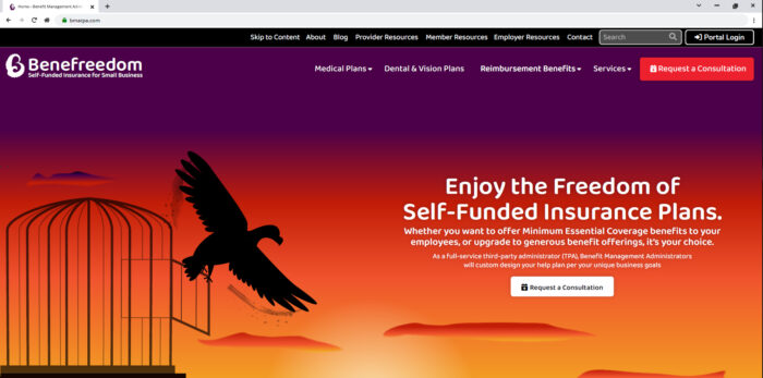
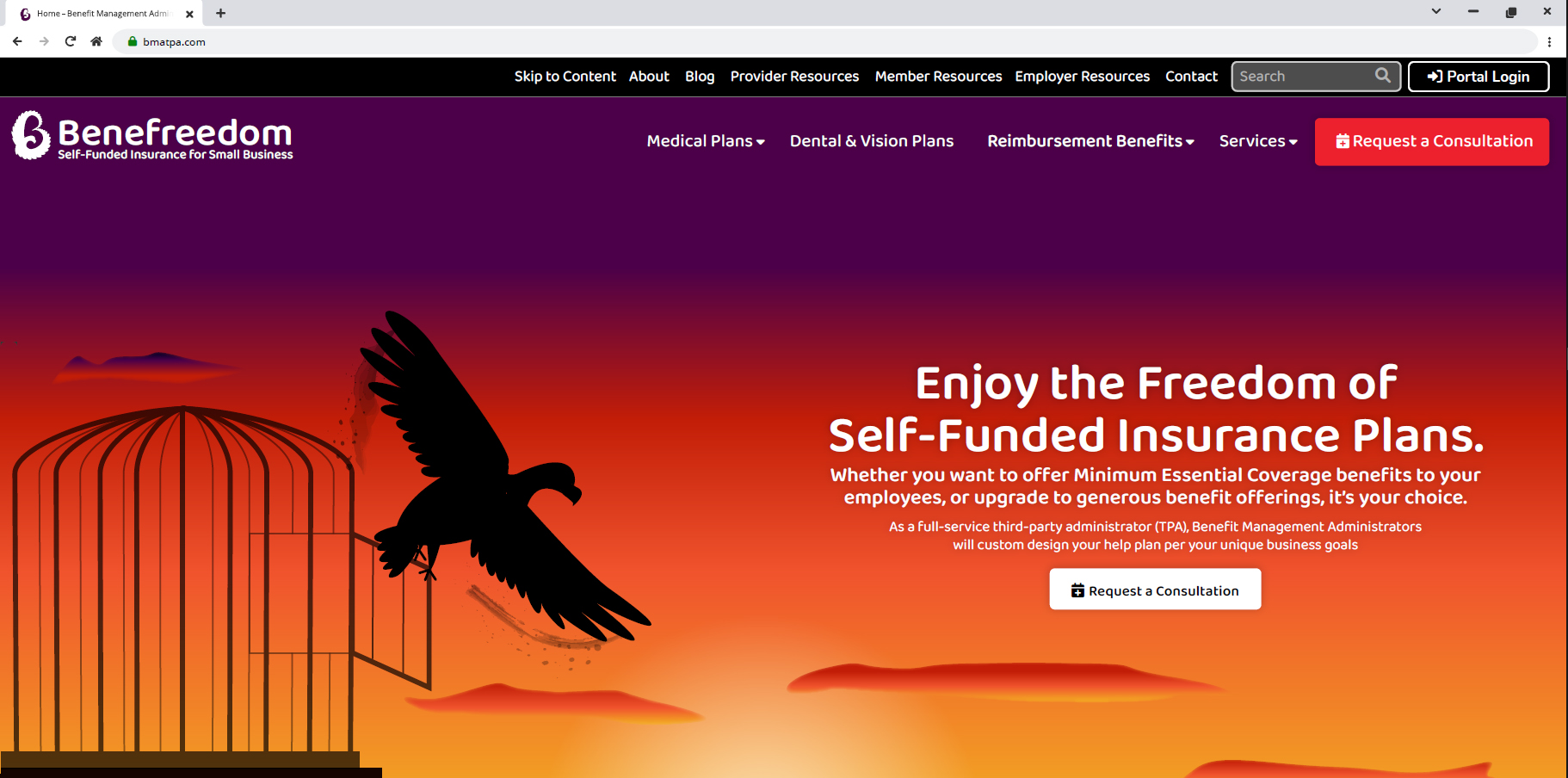
- One of the structural changes I made in this was the menu. The previous menu design seemed too focused on the company and it’s ego, while making it difficult to find the products and services easily. I wanted to bring the focus on the products and services, so I main those entirely take up the primary menu space. I downgraded the About Us page to the secondary menu, and cut the completely useless pages to pitch to Brokers and Employers; those pages were completely filler and brought no value. The best pitch to them was to simply look at the products and services.
- I also took off the live chat and phone numbers in the top. It is extremely rare to get a phone call for sales, and it is actually easier when they fill out the Request for Consultation form. Putting in the phone numbers made the old menu cluttered and confusing. I did add the contact button in the secondary menu, so people could still find the number, plus the number was in the footer too. There is also a floating box for live chat in the bottom right corner of the screen, so having two chat buttons was confusing and scattering.
- I made the search easier to see, and moved it closer to the Portal Login button. Some users I have seen don’t understand icons without labels, so I wanted to make it plainly clear this was a search. Moving the placement also helped with the visual hierarchy.
Old Menu:
New Menu:
“Freedom Design”
One of the problems with the branding in general was it was very generic and lacked personality. It was very neutral and left a forgettable encounter.
At first I was kind of scared to do this design. Most of the times things get re-hashed, so pitching the idea to do a complete brand overhaul was a risk that it might not be accepted. But once I sat with the idea, how could we ever really get different results unless we really changed? Puttering around with a few icons and photos, but keeping the same colours, fonts, and messaging, was clearly not leading to enough sales. We really needed to start from scratch.
I wanted to give the brand a story it could tell, with a punch of personality. I liked the “freedom eagle” design concept I came up with, so I thought I could take that eagle and make it into a character someone could follow. The eagle could tell a story, remind us of freedom, and was a heck of a lot more unique than stock photos. Once I ditched the old-styling and dove into the new branding-everything, I really had a lot of fun getting into the design.
I figured, I needed to give the design a full hearted try and at least get it out of my system, before doing a safer design. I also thought I could possibly use some of the joy making this design to spill into the other designs that I were struggling with. I did get to carry in some of the same copy into the other designs too.
I took off the Portal Login button from the content area, as I did not want it to compete with the call to action. I also made sure the first content block was very simply, with clear sentences and graphics that supported the story.
To satisfy the sales girl and get some buy-in from her, I stuck in those quick links for products and services towards the top of the page. It felt a bit repetitive since this was in the main menu and in the content as you scrolled down, but I wanted to give on that item to increase the chances of approving this design.
[gview file=”https://www.ellicesanchez.com/wp-content/uploads/bma-20230730-freedom.pdf”]
“Money Design”
I also created a design version that was “safer” and an evolution of the current website design, kind of just reigning it in from the scattered focused it had. I kind of joked in my mind that this was the “Mr. Scrooge” design, as the leading sales angle was that this was cheaper. it was a bit more difficult for me to start flowing with this concept, but I did the best I could. I wanted to make to to offer an option that the boss would like.
About a year before this, we had tried to re-design the website before the project got sidelined, and there was talk of “supporting profits and satisfying employees,” but I felt like saying both was confusing; you really just got to pick one angle to go with. Also, it felt unintuitive that employees would be satisfied with a health plan than put more cost burden on them, so the company could make profits; it felt like too much of a lie and I cannot lie.
I ran both the Freedom Design and Money Design by the sales girl, and she preferred that the Services be mixed in with the Benefit Plan Products, so I did that on this mock-up. To me, it made sense to separate the two items, so I left them separate in my “Freedom” design.
[gview file=”https://www.ellicesanchez.com/wp-content/uploads/bma-20230730-reduce.pdf”]
“Tech Design”
I also remembered that the boss wanted to emphasize technology more, so I kind of played around with a concept like this, but it felt generic too me so I had trouble diving into this direction.
[gview file=”https://www.ellicesanchez.com/wp-content/uploads/bma-20230730-tech.pdf”]
Services