Member User Training Guide
Overview
Training guides are not the first thing that comes to mind for show-stopping design, but I think it is important.
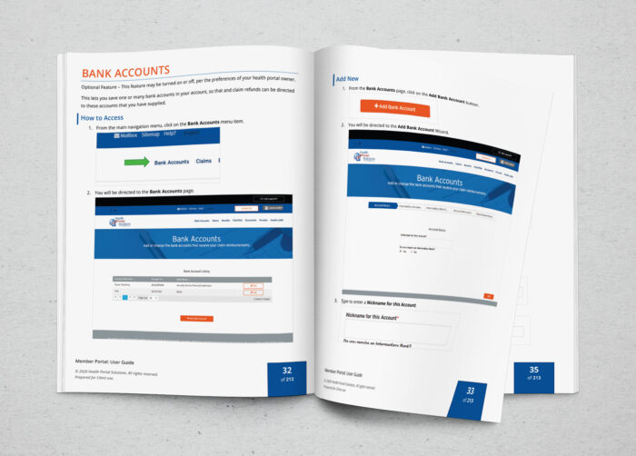
Training guides are pure design, in a functional sense. Guides are meant to help a user learn something new and follow directions. Even though that target sounds simple enough, it is often missed. This is a time to keep to the basics of design, typography, and communications. Having the right amount of text, having the right amount of screenshots, and directing the users’ eyes to the right part of the page are critical, and can often be overwork/underworked.
- In this user guide, I kept within the design constraint that the marketing department or business analysts wanted to be able to update the guide themselves, so I used their preferred program: Microsoft Word. Word actually allows for much customization and styles; most people don’t dive deep enough into these.
- I set the company colours in a defined MS theme and set the desired font family in a theme as well.
- I assigned the desired font attributes for the Normal, Headings, and Strong classes of the word document. This allowed for the design to be maintained and updated with less manual work later.
- I wrote out very explicit text of what to push and type, towards the user, leaving no room for error or assumption on my part. I also used large arrows that were in a different style to the screenshots, as to make them stand out.
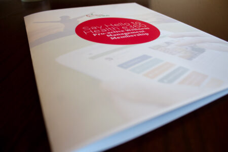
Note: due to file size, I have only posted a limited amount of pages; you’ll see enough for evaluative purposes.
[gview file=”https://www.ellicesanchez.com/wp-content/uploads/Guide-Member-20191226-web.pdf”]