Claim Funding Interface
Overview
This was part of the company effort to convert the health portal from the older framework, to the newer one. I myself previously designed the older design as one of my first design assignments in 2016, but I was happy to make improvements. When I had started working for the company, I felt I had less say in the design outcome and kind of stuck strictly to what was asked; this time I felt like there was more leeway to add more. So, in addition to showing how the design would translate into the newer framework, I added some extra functionality.
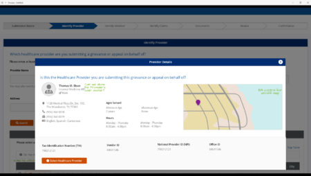
For clarity, there are 3 frameworks at the company. there is a super old one (like a 2000 version), an old one (like a 2010 version), and the responsive design one (2016 version). The Payer UI standard is on the “old framework (2010)” while this feature is on the “super old” framework (2000) that will be shut down soon. The Employer UI is on the responsive design UI. I design the UIs to work within the set themes of their framework and place the UI objects within that.
One of the things that tends to happen is that sometimes the mock-up design looks better than the developed UI. Sometimes the developers just don’t see the CSS nuiances, or they change things without asking. I really tried to make this design clear.
Like with most of my assignment, I was the lead. I took in the requirements, made the design and was responsible for QA. I worked with the planned developer while gathering requirements, talking with accounting users, and when presenting design revisions, so he would be clear on the problem we were trying to solve and the goals/visions of the feature I also met with business analysts and the sales team to make sure they accepted the design and I incorporated any changes they wanted..
Accounting UI
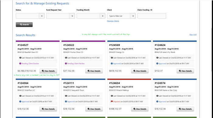
- One of the more confusing things of the previous UI was that the programmer separated the “view” mode from the “edit” mode completely, This made managing claim funding cumbersome for the accounting users. I decided to merge and integrate these UIs as much as possible.
- Another change, was I added in ID number style Claim Funding IDs. Previously, a freeform description textarea was used as an ID.
- I also added a TPA settings UI, so the TPA can set things once and not have to do them respectively.
- I added a Client settings UI, similiarly to have the accounting users set preferences once as defaults, and not have to do them perpetually.
- I also enhanced the Compose a Messsage UI to let the accounting users send custom messages on the fly. I had initially designed this out, and then I asked an accounting user for their pain points, and one of them was that she could only send a canned, uncustomized message in the app, then had to immediately send an email to explain herself. This new UI really solved that pain point.
- Another pain point for the accounting user was that she had to upload files one at a time. That was a :feature added by the developer in the old UI. I made sure to add the requirement for the new UI to allow multiple files to be selected at once for upload. This may sound like a small change, but it really sped along the UX for the accounting department tasked with adding MANY of these daily.
https://xd.adobe.com/view/025797bc-c37c-449c-acf5-205585c0b650-5704/
Employer UI
The Employer view is similiar to the Payer view, but the Employer view is in the responsive design framework, so it looks a bit different.
This UI has different functionality from the accounting UI, as Employers can approve and pay requests, and cannot add a claim funding request.
https://xd.adobe.com/view/f36aebdb-75d7-4c4c-9533-ffd236c86dbb-a639/
Services
prototyping / UI/UX / XD