Logo Update for BMA
Overview
Logo design is one of my most favourite things. It can have a great impact on the company… how outsiders perceive the company and it can set the vision for the employees.
In my part-time job, the boss asked for a refresh to the company logo with a pretty loose scope. Basically, he wanted the BMA letters to change font, and to add “USA” at the end of it.
Simply changing the font did not seem like enough to me, so I offered more roboust concepts appropriate for the company size.
In some of my concept sketches, I took “USA” in a less literal fashion and thought it could mean the ideals of the United States, like “freedom,’ so you’ll see I used an eagle in some of these sketches. I did also offer ideas more in line strictly with what was asked for…. just “playing around with the font,” and “sticking USA on the end,” but I myself felt like these concepts were not as thoughtful, and rather just looked like style for style sake.
Other concepts I started to venture into were medicine or technology, but I felt with the directive of incorporating “USA,” the likely hood of stakeholder acceptance would be very low, so I did not go very far in that direction.
As this was for a job, I actually started this project about two years ago and then it took a pause due to other pressing job needs. It was during the summer when most employees were on vacation that I was able to focus back on this.
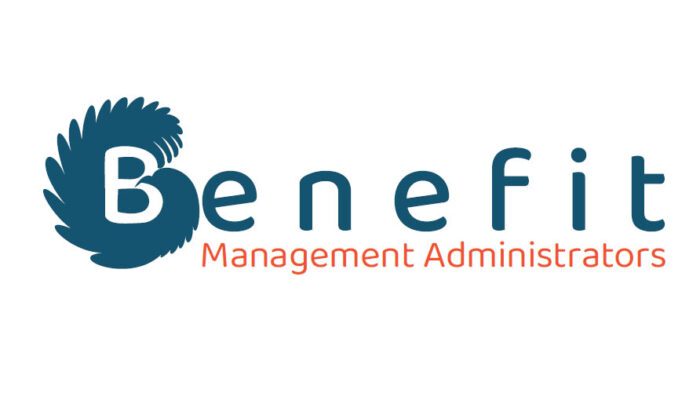
I do admit, I am really proud of the two B concepts you’ll see to the end, but unfortunately, I was not able to get those approved by the boss. In the end, the boss wanted to use the logo from the child company, and slap on the company name with spelled out. I particularly don’t like the child company logo, so it was to my disappointment for it to spread to this company too, plus I think it will make brand confusion and the child company’s clients may think they are getting competed with.
I suppose a kind of change that I did like was to spell out the company name; the acronym name really meant nothing to people outside of the company and was probably best kept as an internal company name, Spelling out the name did help outsiders to understand what kind of company “BMA” was. Although, I kind of think the company name turned into an acronym is because the official company name is too long; it is made from three long words, and comes across as a business description more than a unique name. In a follow-up project to this, I proposed changing the company name to “Benefreedom,” so it could be more unique and condensed to a single word.
Below are concept sketches, and the revisions as I went along.
These are the sketches I started off with.
I know some of them are kind of rough, but in the concepting phase I like to just get all ideas down and judge them later.
[gview file=”https://www.ellicesanchez.com/wp-content/uploads/BMA-logo-sketches-20201117-sm.pdf”]
After the 2 year hiatus. I started working on logo concepts again.
After doing some sketches, I remembered I had done sketches before and then referenced those original ones again.
[gview file=”https://www.ellicesanchez.com/wp-content/uploads/20230714170422271-sm.pdf”]
I then took the pen skecthes to the computer and refined those ideas.
(The final page of this PDF was also something I did after presenting the ideas to the boss.)
[gview file=”https://www.ellicesanchez.com/wp-content/uploads/BMA-logoconcepts-20230718-sm.pdf”]
From that digital sketch phase, I put together some presentation-ready logo concepts for the boss.
My favoured “B” concepts were part of this presentation. After showing these, the boss said he would like to incorporate technology more into the logo; this was in no way part of the original scope, but I went back and sketched some ideas like this. The boss also said he could even see us re-hashing the HPS globe logo for BMA.
[gview file=”https://www.ellicesanchez.com/wp-content/uploads/BMA-logocolours-20230718.pdf”]
I revised concepts based on stakeholder feedback.
I went ahead and got the “tech” logo concepts together, and I thought they were pretty good.
I also gave the boss a version of the globe re-hash that he wanted, exactly as is. In regards to the globe logo, I tried to offer a different version. I flatten it and simplify it. Working with that globe logo with so many elements and so many colours has made it difficult to work with over the years. It made the logo inflexible in being reversed and not possible as a 1-colour print job, so my attempt to simplify the complicated logo was to remove some of those hurdles.
I also tried one more attempt in getting him to buy-into my favoutie B + eagle logos. I did prefer the B + eagle/freedom concepts over the tablet and laptop concepts myself, as I felt BMA was not really a tech company and the :”freedom” metaphor played well with the freedom to build your own health plan the way you want.
[gview file=”https://www.ellicesanchez.com/wp-content/uploads/logo-presentation2-20230724.pdf”]