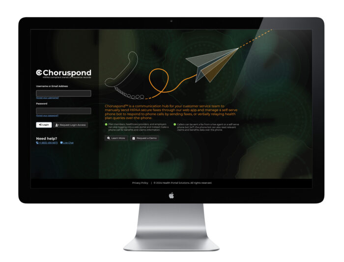
Choruspond (Fax & Voice Web App)
Overview
This project was really exicintg for me. I will take you step by step what I did.
Project Start
One of the developers on the team said he needed a design. He told me the scope of the project was to revise the code and the UI to modern standards. From the look of it, this code may very well have been from the 90s and never touched since. I was also told since this was a complete code re-write, and not part of the base code of the company’s main web product, this could be completely different and I had a full license to go crazy.
When I got the ticket, there was only one line of text in the scope, with someone asking for a ticket to be made. Like many projects at this small company, I needed to write out the ticket to analyze & document what we currently had developed, ask real users (1) how they used the web application, (2) what they would like to see “fixed,” and (3) what ideas or functions they would like developed, define the requirements for the new application, get together testing logins and scenarios, and create a proposed new design.
Analyze & Document What we Currently had Developed
This old application was quite old and rusty so I spent some days looking at what was currently coded, and met a few times with the developers so they could try to explain what was going on (or supposed to be going on) on some of the interfaces. At some point, I felt familiar enough with the product to at least tour participants in a meeting around the web app, so I booked a meeting with a company that uses this product (BMA) ; the company (BMA) is the parent company of my employer, so this was easy to ask them.
Ask Real Users
From what I was told by the business analyst team, employees of BMA used the IVR FaxBack application quite often and they knew what to do/ how to use it.
I sent out an email invitation to the relevant BMA employees saying that we were re-designing this application from scratch, and I wanted their input on how they used the web app in their day-to-day job duties, to hear about any frustrations with the web app, and to hear any ideas or features to add. It turned out, more people than I expected wanted to jump into this meeting and they were excited about a new tool to make their jobs easier.
- The accounting guy described how his usage of the web app was limited. He logged in, took a screenshot of a billing report, and then logged out.
- Account Managers on the meeting said they would laboriously upload 100s of Word templates, changing out maybe a company name and logo, but everything else staying the same.
- Customer service was on the call. When I demonstrated that the web application could send a fax, they got excited, and then explained the convoluted way they sent faxes from their computer’s desktop. They were excited to send items from the web app directly… a feature that currently existed but looked so confusing and hidden, it was completely missed by common users.
- A business analyst also shared how the user interface to customize the voice steps of the IVR phone system was so confusing, they normally just gave up and asked the programmer who had been at the company for 25+ years to make the needed change.
Analyze & Document What we Currently had Developed
Taking into consideration what I heard from the discovery meeting, I then went back to analyzing the current application myself.
To get a better grapple of the application, make QA testing easier, and make a historic record, I began to screenshot every page, and document test-case variables to render search results on the screens.
For instance, in this below scenario, one had to log into a separate website, find the data for a user there, login to the IVR Faxback web app, follow a certain click path to see a claim. (Note: the PHI is from a demo group and is not real.)
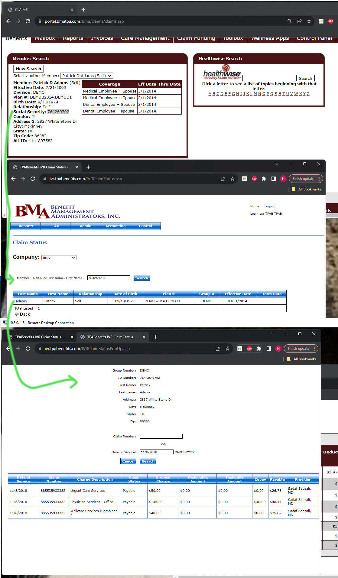
Gathering screenshot helped me a lot to have findable users when I needed to see an interface. Many screens would not show any data, unless I had some valid search parameters in my query.
Define the Requirements for the New Web Application
It was kind of early on, but I started high-level list of what the IVR Faxback web app did, the goal of the app, outlined the stateholders and their respective priorities, and collected templates I downloaded from the web app for reference when I did my design.
Personally, I find creating the visual design often reveals a lot of requirements, so I tend to sweep those in as the design flushes out.
Create a Proposed New Design
Some considerations I went through when beginning my new design:
- I wanted to have the design be easy to use, especially for users that could use the app as much as a few times a year. Infrequent users don’t have time to memorize and learn quirks.
- I wanted to really spell everything out and explain everything directly in the UI. I did not want someone to have to find a PDF on a shared drive to get definitions or learn steps to perform an action.
- I wanted the website be be WACG 2.1 AA complaint.
- I wanted to make the website look distinct from the main web product that HPS makes, so users would not in any ways confuse the too (that would be a nightmare for the support phone line).
I first got started, at the beginning,…
I created a basic login page. I knew it was kind of rough, and I would circle back to it later. (I actually made this the last thing I polished before feeling done.
I already felt the name IVR Faxback gave a product description that did not fully describe what-all the product to do. So at the beginning, I threw up the name “Fax Manager,” and just used the Font Awesome icon as a logo placeholder for the moment.
The second thing I worked on was the navigation bar.
I typed up the sitemap from the old application, updated the labels for clarity to non-programmers, and re-arranged the page hierarchy based on frequency of use and grouped similar function or functions that may only be used once a year. I used that list to place into the design. In order to make non-verbal communication easier, I put in icons with the navigation links. I did end up tweaking the navigation more before I finished the design, but that is what happens are you learn more about the page functions and how your mind may categorize/label the pages.
The Dashboard Upon Login
One stranger things to me was upon login, you see a blank page. It is a waste of a step. So I wanted to quickly convey a lot of information upfront, and offer users a chance to start sending a fax right away.
old dashboard
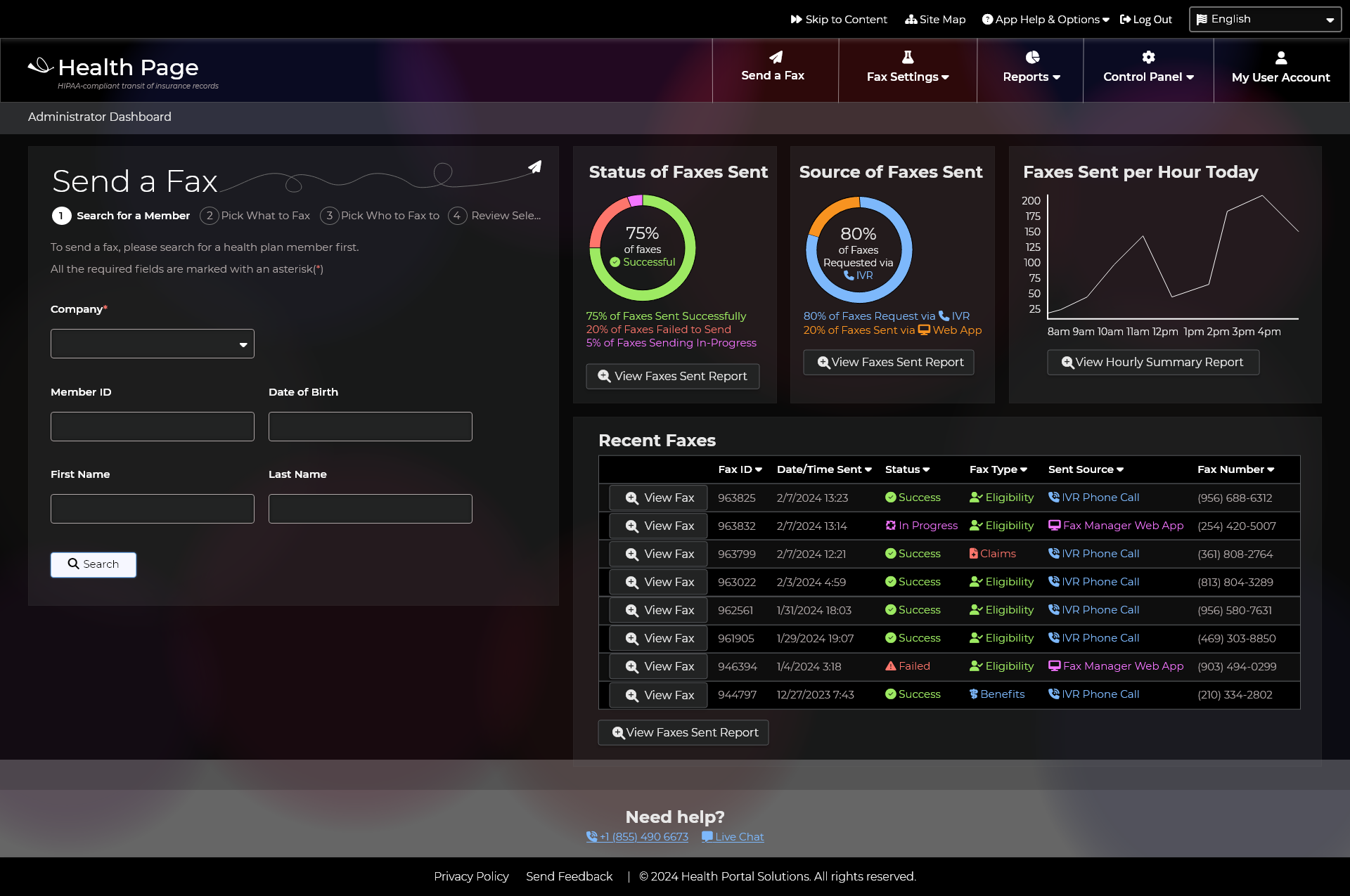
I ended up updating the dashboard after I finished designing the reports section, to better match the final reports designs, and link to the edited reports list.
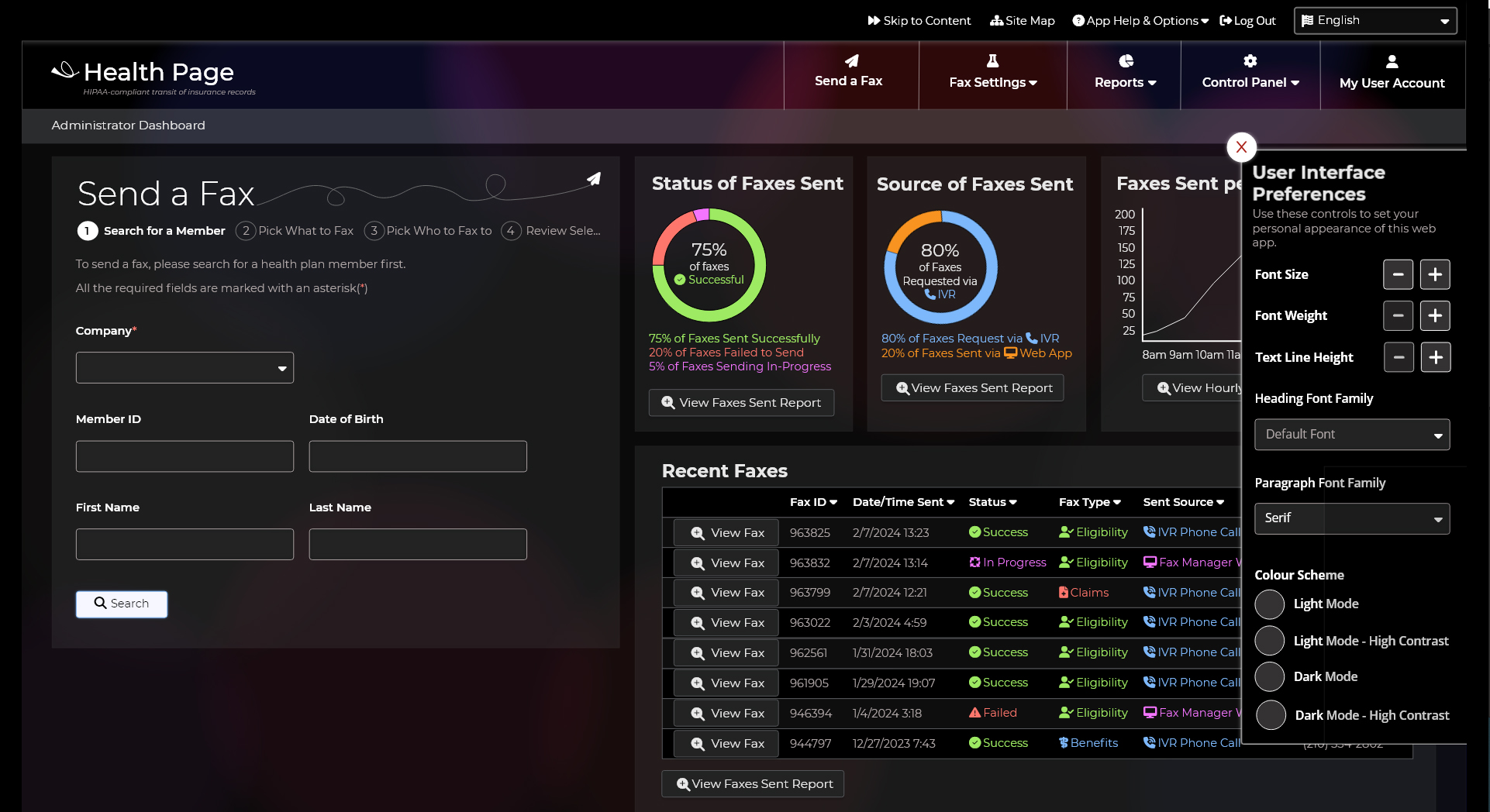
User Interface Preferences
I like dark mode myself, but maybe not everyone does. And in that line of thinking, I might feel I have the right font size for my device, viewing distance, and eye balls, but the font size, weight, family, might need to change for someone else. I put in a User Interface Preferences panel so users can give themselves what they need. I also thought calling it User Interface Preferences might enourage more people to set their preferences, rather than obviously labeling it as a feature only for people with disabilities.
This was a new feature, not in the previous product.
Send a Fax
Looking at the offered functionality of the old web app, I thought the Send a Fax feature needed to be easier to use and find. The account managers and customer service teams were excited about this feature, so to satisfy the stakeholders, I wanted to give them everything they needed.
Some of the ideas about this workflow:
- To meet WCAG, I make the numbered-step navigation use a combination of filled and outlined elements. Completed steps were crossed through, so even if someone could not perceive differences in colour, they could still see shape.
- At first I had the Search Form on a separate page from the Search Results. I thought this resulted in less clutter on the page, but then I realized it was not clutter. Users needed a reminder of their search parameters to let them know how they got to these search results.
- I spelled out many of the words, which were acronymed in the old UI. I did not want to assume everyone knew each acronym, and it would make the page easier to translate.
- I used colours and icons to communicate statuses, so a lazy person could read everything at a glance.
- I changed the order of steps. In the old UI, you needed a Tax Identification Number from a healthcare provider upfront. I thought it was potentially a waste of effort to collect/input this data first, if the member data could not be found, so I put the member search first.
- I combined the Fax Member Benefits and the Fax Claims into one search. It was cumbersome searching for things to fax in two different places in the old UI
- Since we are faxing PHI, I put in a review/verification step, to make sure the right person was getting the right member data.
- I added a Fax Preview in the review step. The top reason for failed faxes is someone has not assigned a template to the Company/Group. This preview will let the user see exactly what is being sent, before a problem occurs.
- I added a confirmation screen at the end of the flow. In the old flow, you clicked a button but it was not clear any sending actually occurred. In this new way, you can instantly see the Fax ID number, and monitor the progress in the linked report page.
[gview file=”https://www.ellicesanchez.com/wp-content/uploads/SendaFaxDemo.pdf”]
Once I finished this section, I was pretty much done, but I did circle back to put in clear section headers into the page, so people with screenreaders could jump to headings on the pages.
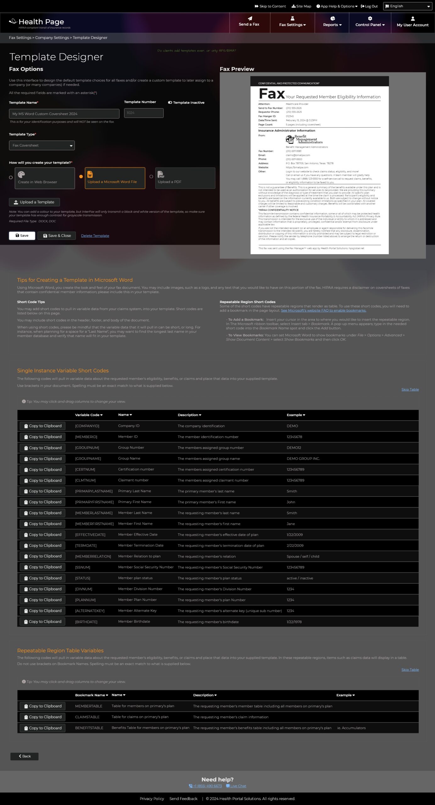
Template Designer
The old way was so confusing, cumbersome, and convoluted. The account managers basically uploaded the same template again and again, and swapped out a name or logo.
I decided to allow for manual Word uploads, but also allow for an in-page designer. There could be a master template, and that could plug in variables like phone numbers, logos, disclaims, but the template shell would stay the same. The current coversheets had some difficult to read designs, plus did not include the standard fax coversheet customary data, so by using the in-app editor, the designs can be more fax customary, and easy to update in bulk (like maybe updating the disclaimer for all at once).
Furthermore, since we are sending PHI, steering people to have a coversheet without PHI would be more secure than having PHI on a coversheet. Many of the user-generated templates through PHI on a coversheet.
I put in the option to design a separate cover sheet, eligibility sheet, benefits sheet, and claims sheet.
On the Claims sheet, I proposed the option to make the page be in landscape more, so more data can send in the expected table/grid, and be easy to read (as opposed to a narrow table with a lot of line breaks or a microscope font).
[gview file=”https://www.ellicesanchez.com/wp-content/uploads/Coversheet-template.pdf”]
MS Word upload option, with re-worded and simplified instructions at the bottom
[gview file=”https://www.ellicesanchez.com/wp-content/uploads/Claims-template.pdf”]
Other notes, not wanting to write whole paragraphs on them.
- In the old web app, there was a confusing layer of pages. One page to make security roles. One to assign people to a role/class. Another to make users. To me, combinding these functions on the user account page made more sense, and to cherry pick which user individually gets to see what page made more sense than adding a complicated layer of classes/roles, which could be made for just one person.
- Some of the reports said basically the same thing, so I condensed the reports. I made sure to spell out acronyms, style phone numbers with parenthesis and dashes, align number columns right, and assign colours/icons to statuses. I also wrote a description of each report based on the old training manual Word document, so users would no longer need to open a Word document to understand what report they were looking at.
IVR Configuration Phone Call Settings
Another huge overhaul, which I think makes this product usable more than a single senior-staff member is this new way to configure the phone call workflows. With this interface, clients could configure their own voice workflow.
The old UI
The old UI had a very programmer-centric list of options, allowing for only a number input. It mixed static concepts like, “max number of faxes allowed,” with dynamic questions, like, “Please enter your social security number.”
The New UI
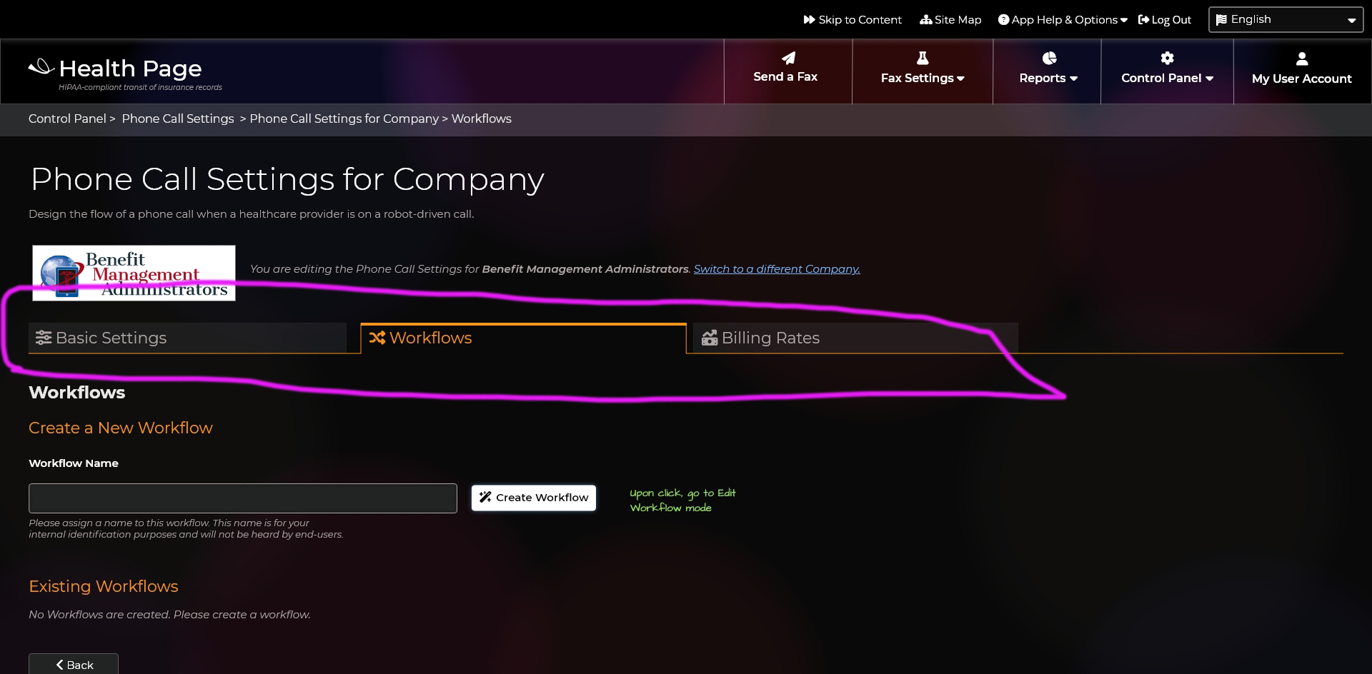
I separated the static questions from the dynamic questions and threw them under a Basic Setting tab.
Under the Workflow Settings tab, I created a workflow builder. Step by step, you can add more questions to your phone system, allowing for different question types. This let the user have a visual interface they could follow to add more steps, answer options, and how the step proceeds. You could have a single workflow, to multiple workflows. Workflows can also jump the user to another workflow, like a help menu.
Re-naming the App
As I finished working on the phone call settings (phone call settings being a much people-friendly name than IVR Configuration), I began to think of the web app name again. In addition to faxing the requested data through the app, there was the phone component…there were options to have the phone robot speak the information. Healthcare providers AND members could made calls to this phone system. To me, it was like there were multiple modes of communication and multiple audiences. The sales person at the company called this app, “Provider Faxback,” as IVR was a technical acronym, but that made it sound like members were not allowed to call (but they can).
I had simplified what the product did to this sentence which I used as the tagline: HIPAA-compliant transit of insurance records.
I did not want a straight-up have a product description as the product name. Brand names are unique. No ones sells “milk” as the brand name “milk” or even “cow milk.” You literally can’t trademark a name that is a product description. If our name is unique, it can make the product unique. If literally other companies sell “IVR Faxback,” then the product could be bought by a competitor.
I began to expand my list of words and concepts (seen below). Word that invoked transit, delivery, insurance were okay. In order to have something not completely like a product description, the name had to have style or metaphor. I tried to not judge, edit, or scrunitize the list. I just needed to get the ideas flowing and I could analyze it later.
I started learning to the name “health page” and almost settled on it, since a king’s court had a page that would speak/relay information and “page” also evoked a paper fax, but again, this system had a web component and a voice component, so I pushed on with my word list.
- horn
- platter
- phone
- transit
- scroll
- Hermes Fax
- Paper Plane
- Fax & Voice
- Med Bounce
- Med Send
- Med Deliver
- Med Courier
- Fax, Voice, Web
- Genie Send
- White Hole
- 24/7 SelfServe
- 24/7 Self Help
- RoboSend
- RoboDeliver
- Robit
- Coil Cord Courier
- Jacked Courier
- CordlySend
- Curly Send
- Speedy
- NImbleBot
- Dial Tone
- Ring Relay
- Med Telegram
- Medigram+
- Medipage
- Datadispatch
- Gopher
- Monkey
- Robot
- Pigeon
- Dog
- Barker
- Health Bark
- Health Fetch
- Health Page+
- Insurance Page
- Health Servant
- Health Line
- Service Line
- Go Offline
- Unnet
- Un-net
- No Net
- No Pass
- Less Password to remember
- EasyPass
- Call For Help
- Hook me up
- Tell me now
- unwired
- Phone Me
- SentIt
- ShareIt
- Speak It
- Speak Easy
- Virtual
- Virtually
- VirtualPage
- Virtual Pigeon
- Data Pigeon+
- Digital Pigeon+
- Pigeon Page
- WireTap+
- WiredTap+
- Wiretapped
- Slingshot
- Call Me
- Call Nexus
- We Deliver
- We Send
- Bliss
- Easy
- Simple
- Happy
- Hero
- Hero Pigeon
- Hero Page
- Smooth
- Lightening Pigeon
- Secure
- Call Me
- Call Us
- Cordly
- SwiftSend
- Cheeta Send
- Cougar
- Bear
- Otter
- Hawk
- Hummingbird
- Humzinger
- Humringer
- Fetch
- Operator
- Operator Bot
- Ferryman
- Transit
- Communication
- Communicat
- Cord Send
- Cord-innated
- Umbilical Cord
- Umbillicord
- Umbillicord Send
- Data Dispenser
- Communication
- Health
- Communealth
- HealthComm
- Health cords+
- Health Chorus
- Insurance Harmony
- Insurance Conductor
- Data Conductor
- Insurance Conductor +
- Harmoniousness
- Health Compass
- Correspond+
- CorrespondHub+
- ChorusPond+
I came upon Correspondence, which spoke to any means of communication, voice, fax, web, and I liked it. I took that word a step further and changed it into it’s phonetic break-down of “Chorus pond.” This was unique and encapsulated a lot of communication, while also not limiting the tech to only faxing or only voice.
This name also helped me with some of the graphics. Those big circles could now be lily pads and have some branding meaning. With this new name, I updated the login page design. I did add an intro sentence to explain the purpose/value of the app in a nutshell, for anyone who stumbled upon the login page.
Since the name change was also a risk, I knew the logo would be a risk, but I wanted to present a decent concept for the best chance on team-acceptance. I designed a quick little logo in a thumbnail sketch and then brought it to the computer, and then into the UI’s homepage.
Present the Proposed New Design
This is where the project took a sharp turn.
Apparently the senior IT guy had ideas in his head. Nothing was written in the ticket, and the man is the least available person in the company.
I started the meeting to present the new UI and the participants liked how much more clear the UI was, but the senior IT guy did not want to see so much change. He said he wanted the developers to code the new product first from the legacy code to the modern code, and then some time later we could maybe add a cosmetic layer to it.
To me, this seemed really backwards. If you have a design, you have a plan. You can choose the right programming language to support the requested features. The sales person had to leave for another meeting so we picked up the meeting again the next week.
In the part two meeting, which did require the senior IT guy, he did not show up. I suggested we re-schedule, but he apparently instructed to someone we go on. I do admit, such a start without a critical person made the presentation feel more unvalued, but I proceeded. The meeting participants really liked the new phone call settings UI. About 45 minutes into the 1 meeting, the senior IT guy joined the meeting silently. I asked him what he saw and thought, not knowing when he jumped in. He said he only wanted coding updates to remove SQL from the product directly, and to use stored procedures. He was okay with the old design still existing. I really wish that type of wording was not in the vault of his brain, and in the ticket; it could have kept us focused on what he wanted. The proposed design was possible but it would take more than the 4 days of coding he wanted on this project.
I was a bit confused as his vision of the product was very narrow. BMA said they really wanted to be able to fax in the web app, and manage the fax templates easier. He thought this app should only be used for managing the voice workflows and an occasionally QA test to send a fax in the app when a problem arose.
It did feel like a waste of time to make the designs, but hopefully some parts can be used later. I do disagree that the design is a cosmetic layer; to me it is an important layer is planning and usability. I would not recommend starting a project coding first, with not written requirements myself. Perhaps if I had more communication about the scope as it was written, it could have changed outcome.
Not all projects cross the finish line, but it is a great looking faxing app. At least I had fun designing it.