Health e360 Logo
Overview
This was done as an inhouse designer to a tech company. The boss wanted to modernize the logo, so I proceeded to present concepts that could work well as an app icon.
Combination of the letter H + an apple.
![]()
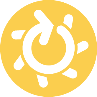
Combination of an 360 degree rotating arrow + the sun (which is associated with health.)

![]()
In the end…
In the end, the boss liked not having the logo stray too far from it’s original colours or format, so as a good designer, I wanted to make him happy. I did make improvements to the logo shape so it could be move cohesive. See below for the logo as placed in a sales sheet.
[gview file=”http://www.ellicesanchez.com/wp-content/uploads/Healthe360-brochure-EmployerLeads-20171204.pdf”]